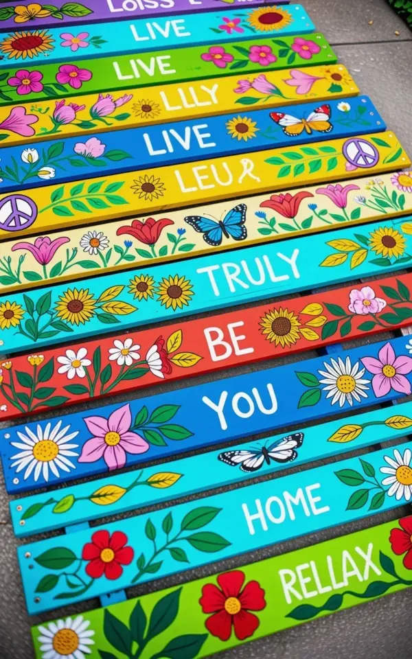
You’ve scrolled past the same garden fence decor a hundred times: plain pickets, white or stained, standing in a neat row like they’re waiting for something. Then you see a photo of painted fence slat art and it hits different. Bright turquoise, yellow, lime green, red, blue. Sunflowers and butterflies and words that make you feel like you’re on vacation. It looks effortless. That’s the trap. There’s one mistake that turns this project into a mess, and it’s not the painting. It’s skipping the sealant. Let me walk you through the whole thing so yours actually lasts more than one season.
Start With the Layout, Not the Paint
Most people grab a fence picket, slap some paint on it, and hang it up. Then they realize it doesn’t fit the space or the colors clash with the house. The layout needs to come first, honestly. Before you buy a single can of paint, figure out how many slats you want and how much wall or fence they’ll cover.
Take a photo of the space and draw your slats over it on your phone. Or mock it up on the ground like I do with old bedsheets. It sounds silly, but it shows you the rhythm of the row. You’ll see gaps you didn’t plan for and colors that feel wrong before you commit to them. That’s the cheap way to learn.
Pick a Palette Before You Pick Up a Brush
The board I’m describing has turquoise, yellow, lime green, red, and blue all in one row. It’s a lot. It works because the colors share a similar intensity. They’re all a little bright, a little tropical, none of them pastel or muted. If one slat had been a dusty sage green, it would have looked like a mistake.
Here’s how to keep your palette from turning into chaos:
- Choose one dominant color and let the others play supporting roles, usually the same color on two or three slats.
- Stick to colors that sit near each other on the color wheel, or go bold and use direct opposites, but don’t do both.
- Take swatches outside and look at them against your actual fence. Paint colors lie under fluorescent lights.
And look, you can always break the rules. But painting all eight slats different colors without a plan is how you end up with a row that looks like a crayon box exploded. Unless that’s literally the vibe you want, in which case go off.
Work in Themes, Not Random Slats
The best DIY outdoor art of this style doesn’t just show random things on each board. It has a loose theme running through the whole set. In the photo you see sunflowers, butterflies, pink lilies, red poppies, and white daisies. They all speak the same language: garden florals. The peace symbol and handwritten words like LIVE and RELAX keep it from turning into a botanical chart.
Think of it like a playlist. Each slat is a song, but they should feel like they belong on the same album. Maybe your theme is desert plants with subtle southwest colors. Maybe it’s ocean life with driftwood tones. Choose one theme and filter every slat through it. Then the row feels intentional, like a set.
Don’t try to make every slat a masterpiece either. One slat can just say HOME with a tiny flower. Another can hold a single butterfly. The variety in the photo works because the pieces are simple. When every slat has five different elements, the whole row feels exhausting to look at.
The One Mistake That Ruins Everything
Ok so here’s the thing. You can do every step perfectly. Perfect prep, perfect colors, perfect lettering. Ten months later, rain and frost will wreck it if you skipped the sealer. The paint will peel in that weird way where it curls off the wood in long strips. The bright colors will fade to the point where they look faded. It’s heartbreaking.
Use a water-based exterior polyurethane or a clear wood sealer with UV protection. The UV part matters just as much as the waterproofing. Sun damage will fade turquoise and yellow especially fast. Two thin coats, following the directions exactly. Wait the full dry time between coats. I know you want to rush it. Don’t.
Here’s my honest experience: I once used an indoor craft sealer on a sign that lived under a covered porch. It looked fine for one summer. The next spring, the black lettering bled into the blue paint like a sad watercolor. I had to strip the whole thing and start over. That’s the mistake I want you to avoid. This is not where you save a buck.
Remember What Color Your Wall Actually Is
The slats in the photo pop because they’re set against a surface that doesn’t fight them. If yours is going on a dark fence, those bright colors will still pop. Against a white wall, they’ll look even brighter. Against brick, they’ll melt into the background unless you pick something juicier. Look at your backdrop and choose your palettes in that context, not in the garage.
Also think about how the colors look from a distance. That lime green slat might be your favorite up close, but from across the yard it might read as gray or sickly yellow. Walk across your yard while looking at your setup. If you can’t see the design from the spot where you’ll actually be, it might need more contrast between the slats and the background.
The words LIVE, TRULY, BE, YOU, HOME, and RELAX in the photo are painted in darker tones against those bright bases. That’s a smart move. The bright background carries the garden energy, and the dark lettering keeps it readable. White lettering on yellow slats would have been a mess.
Prep Work Is the Difference Between “Cute” and “Quality”
The wood slats you buy at the home center are rough, especially the dog-eared pine pickets everyone uses for this project. They have splinters and sawdust and areas where the grain raises up like goosebumps. Sand them with 120-grit paper until they’re smooth to the touch, then wipe them down. Prime your knots too, or they’ll bleed yellow through your paint in a few weeks.
Let me add one more thing: check the weather before you paint. I know that sounds obvious, but I’ve painted outside only to have rain start mid-project. The humidity. The clouds. The full forecast. Sealer especially needs dry weather, and not just on the day you apply it. Give it at least 48 hours of decent conditions before it faces the elements. Also, stencils can be a nightmare if you don’t tape them down properly. I speak from experience. One corner lifts, and suddenly your perfectly placed letters look like they’re melting.
This is a Saturday project at most. The real time goes into dry times, not painting. But that’s fine. That’s the whole secret honestly. Rushing is what creates the cracks and drips and bleeding letters. Slow down, and you’ll have a row of hand painted wood that actually looks like a thoughtful piece of garden inspiration instead of a craft fair reject.
So here’s the honest version of the process: plan the row, choose the palette, keep the themes simple, and seal it like it’s your only duty on this earth. If you make your own version, come back and tell me how it holds up. I want to see your colors, your words, your garden. Your little corner of the world, just brighter.
Leave a Comment